The house
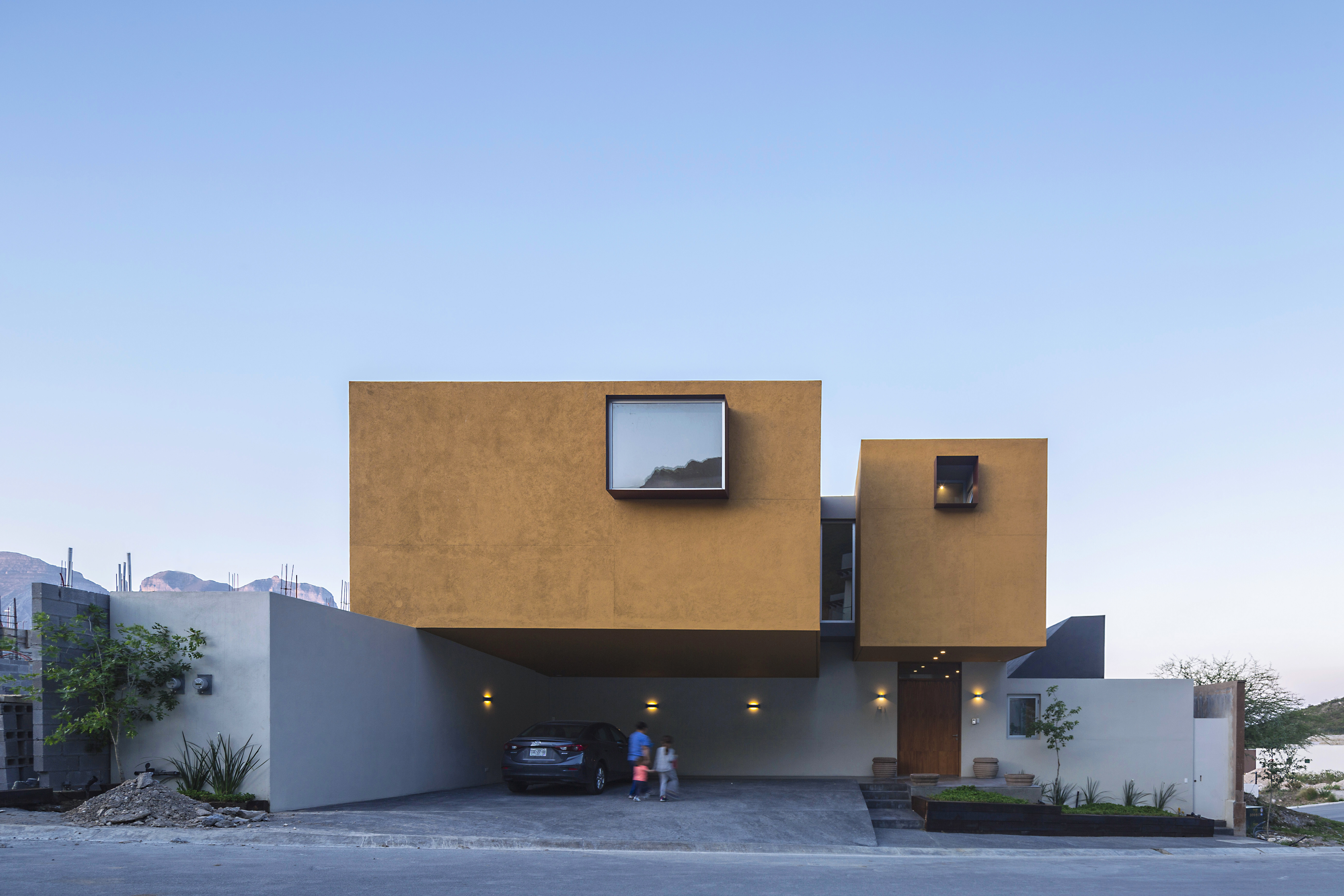
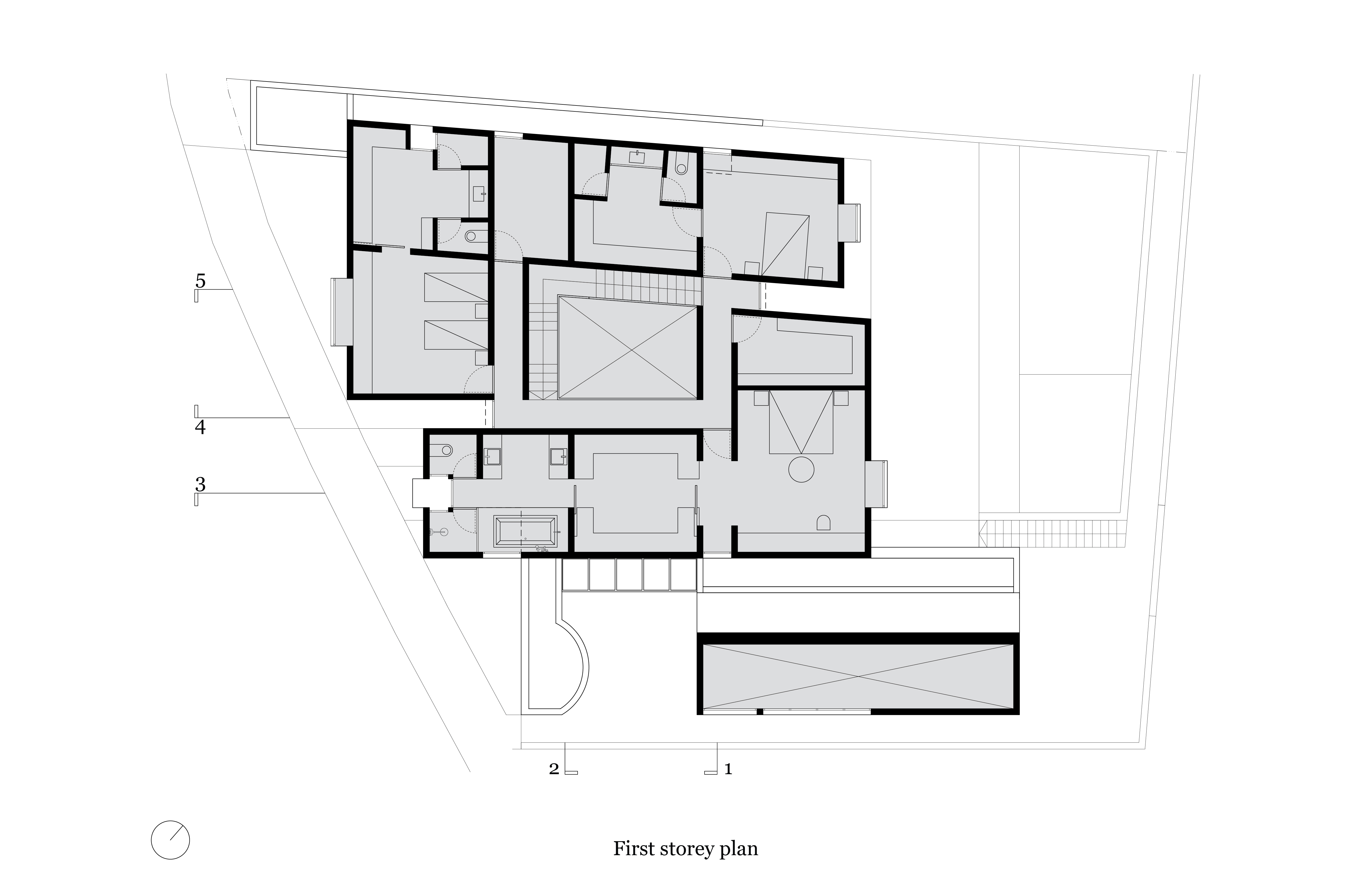
responds to a three part composition, generated according to the function of
the deduced programs and as a response to their location. The crown, in yellow,
enclosed and up top, is the element with the strongest presence. It embraces
the bedrooms and represents the private areas, symbolizing strength and
protection. In dark blue, the pavilion attends to the social activities. Its
characteristic form connects to the sierra: from the inside, it frames the
mountains, on the outside, it relinquishes the view. The pavilion’s live-in
experience is memorable, giving each event the distinction it deserves. The
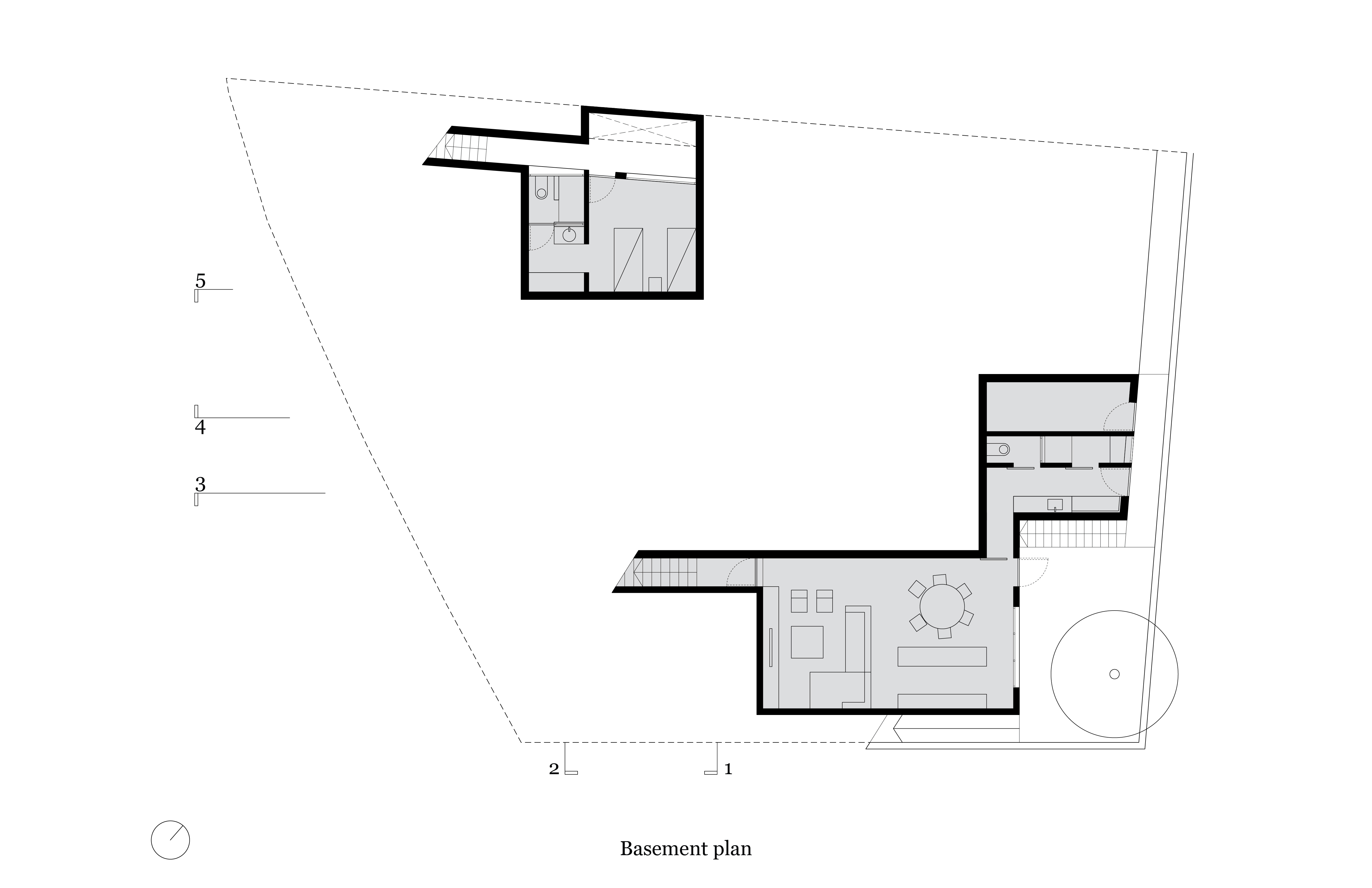
base adapts the terrain to each piece, connecting areas to each other, closing
off from the street and opening up to the garden and the city views. The
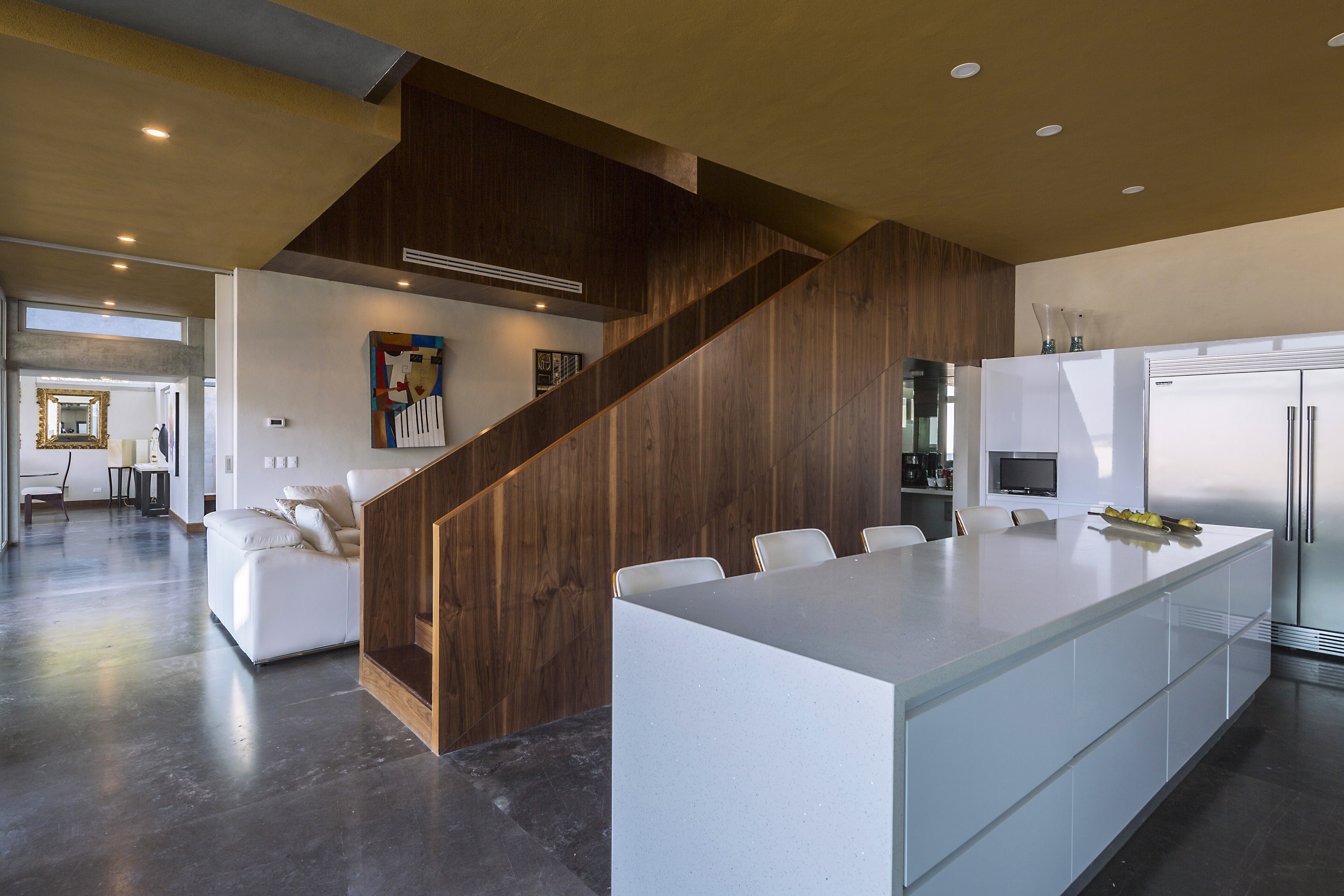
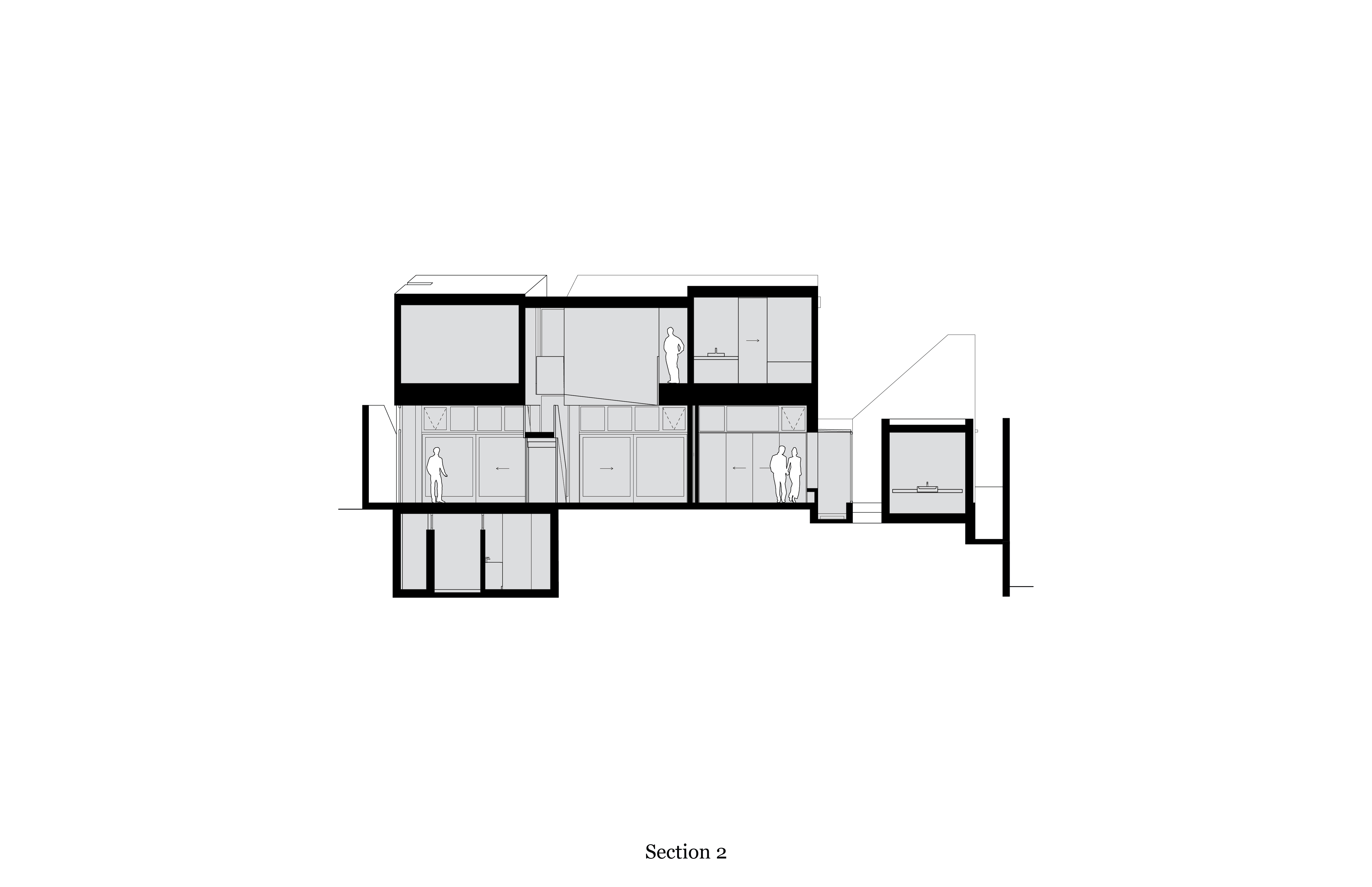
entrance hall unites areas horizontally, while the family room connects
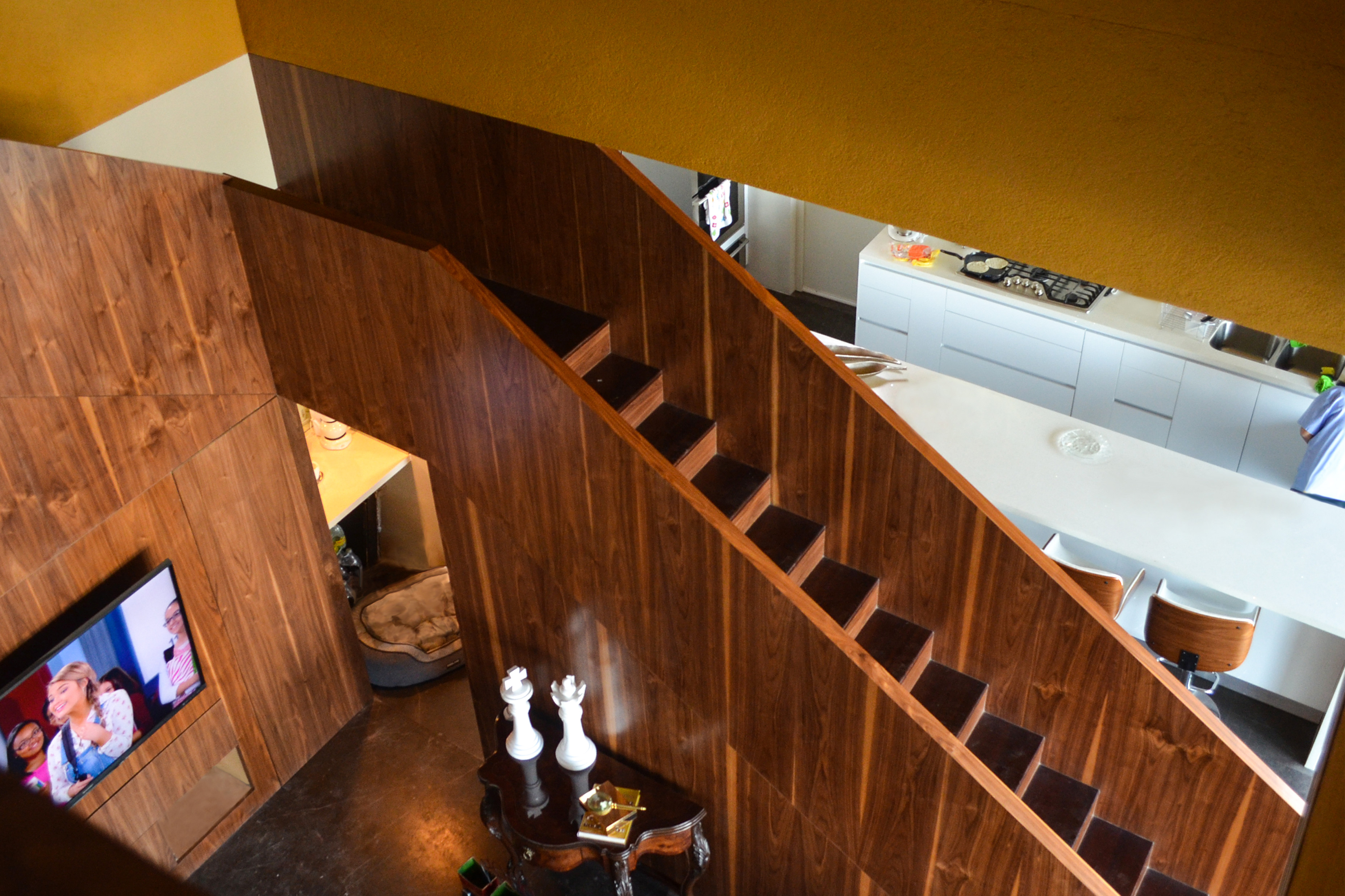
vertically with its double-height that coincides with the center of the upper
floor.
The 548 m2
construction project sits over a 496 m2 terrain of particular conditions.
Bordering the land to the north and east are municipal áreas walled off with
stone. Located in the base of the Sierra Madre, the terrain slopes downward,
facing the street and the sierra to the south, and sits next to another
property to the west. A custom-built home for a family of five with multiple
needs and contradictions. This tension creates the project’s character: a
closed, private home that is also open and exposed, the social and family areas
are separated in different volumes, but also directly connected. The private
area in the second floor is intimate and guarded, but it also permeates through
to the family room, the home’s true heart.
Each of the project’s pieces has a special personality that determines activities and generates different experiences according to each of their functions, as well as the fluidity between the tension and union they create simultaneously. This creates constant impact and provocation throughout time, whether it’s by moving through the house or by living in it continuously. One of the project’s main intentions was to create a guarded atmosphere of shelter and refuge that simultaneously allows the viewer to access exposure to the outside.
As one ascends the mountainside towards the house, its yellow volumes can be perceived as floating against the background of the sierra. The color takes its obvious meaning from springtime, coinciding with the flowers blooming in the same tone. As one approaches the back of the house, surrounds it and observes three of its façades, it’s perceived as closed and inclusive. In the front façade, the most hermetic, the volumes’ cantilever is surprising as an open frontal space that functions as both carport and outdoor reception in an elevation slightly higher than the sidewalk. Opening the door expands one’s view through the reception and the garden, carrying the eye north towards the Cerro de las Mitras. First, the reception grows towards a lateral garden and spreads towards the basement, a half bathroom, the formal social area, and the family area. Whilst advancing, one becomes aware that the entire first level is connected to the garden, and thus, open to the imposing city view. If one walks towards the pavilion that shelters the formal social area and enters the sloping volume compressed into an atrium by its low side, the view suddenly explodes towards the sierra through a large window. The low side connects to the garden, opening through a set of sliding glass doors.
From the reception, one can perceive distinctly to be underneath the yellow volumes. From the family side, one can appreciate the double height’s central depth and distinguish two conjoined L-shaped pieces. The walnut stairway is placed in the empty space that gives way to the upper floor. Upstairs, the atmosphere is distinct. The contrasts between light and shadow are dramatic and, although open to the empty central space, whoever is upstairs controls its exposure. Its openings are different from the ones on the first floor. For the bedrooms, in the most protected character, the doorways are clearly set by the depth of the metallic plaques surrounding each window, dramatizing the light and framing each view. In the hallway that connects the bedrooms and tightens circulation in certain stretches, natural light enters through the spaces between the two L-shaped volumes, allowing one to be exposed to the empty and exterior space.
